I've been working from observational imagery of flowers from within my grandmas house and combined with marks that I had been inspired with by collier Campbell. This delicate hand drawn texture brings the flowers alive and Can be translated well into print. This compositional element of broken up background pattern is interesting as allows you to appreciate the delicate qualities of the over lapping petals along with the colour pop patterns.
poppies

Tuesday, 31 December 2013
Marrimekko
Compositional mark making on a large scale is something I focused on in BA7 although I stuck quite rigidly to a geometric composition, with the use of block organic shapes it breaks up compositions and lines and makes the pattern flow much more easily.
The amount of detail that has been subjected to this repeat is incredible, the drawing has been done to a high quality so it makes the repeat really effective - this is an idea I want to bring into my work, having high quality drawing I can scan in and play with on large scales.
These screens are very exciting on the eye to me. It contrasts patterns of stripes and organic shapes with bright colours that accentuate one another. This is something I would be very interested in doing within my project.
Although the shapes are formed in a geometric structure, the colours allow your eye to move in and out of the patterns and shapes so that the colours are standing out. I admire the use of marks to create the patterns and textures.
Marrimekko is visually inspirational for my ba8 project; it focuses on placement of large scale motifs in bright vivid colours. They incorporate patterns into everyday objects and compose them in organic arrangements layered on top of each other to make a colourful collage of exciting imagery. Marrimekko mainly uses heavyweight cotton for the interior products as these allow the colours to pop and the materials to be practical in durability.
Saturday, 14 December 2013
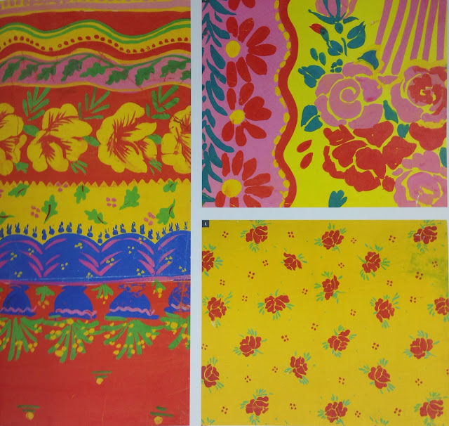
Book Love: Collier Campbell Archive - 50 years of passion in pattern
I love this book, visually it is very inspiring due to its brightness in colour, range of drawings and compositions. the intricate floral drawings mixed with abstract shapes; it has a matisse feel to some of the pattern work, either way i LOVE IT!
This is going to kick start my BA8 project.

This is going to kick start my BA8 project.
Wednesday, 11 December 2013
Junior conversational print workshop
We had to choose a you animal or object to draw in a fun and quirky way. I had already researched some fashion based animal prints with fun, bright colours that were almost abstract to appeal to the younger market. I started off drawing observationally however it didn't really have the effect I would have liked for my print to be successful so I went back to what I had been focusing on in ba7 and used cut work shapes to create drawings.
Using this as a background rather than a finished drawing I drew back into this and found that the image got lost in the design so went back to using cut work to create my imagery.
I was really happy with the way this fun idea of creating drawing was and so compiled my drawings together with a variety of scales to create a successful repeat.
Tuesday, 3 December 2013
Group Project
Me, Lillie, Emily and Olivia have joined forces within a group project to design and make 12 designs ready for selling at Indigo in 2015. We have all been engaged within our own projects focusing on individual elements; mine being composition, Lillie's being colour, Emily's being pattern and Olivia's being knit. To bring in all of our individual elements into one focused group we chose to look at mark-making within within patterns, textures and colours. In Grainne's first drawing workshop we explored this notion by exploring with drawing on paper. We looked at layering, bleaching, cutwork and opaque shapes.
We put all of our work together and selected the ideas we wanted to push and develop forward into print. Our drawings seem quite easy to translate into print:
1. dye the fabric
2. discharge into colour
3. layer up with colour
This will be the transition from paper to fabric for our working technique; as we now have established what our designs could look like we devised a timetable in order for us to be able to test out our ideas.
Monday 25th November: Identify S/S'15 trend and colour palette
Tuesday 26th November: Initial drawings, buy materials and bias binding
Wednesday 27th November: Dye fabrics and test colours and discharge
Thursday 28th November: Start discharge printing
Monday 2nd December: Finish all discharge printing
Tuesday 3rd December: Test out procion colour on top of backgrounds
Wednesday 4th December: Print over our backgrounds, steam, wash and apply to bias binding
Thursday 5th December: Presentation
In order for us to establish a colour palette we need to look at spring summer 2015 trend forecasts so that our designs are commercial for Indigo 2015.
We are going to use coral/peach, sky dusky blue and a navy colour with a yellow accent.
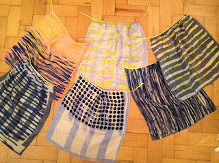
We chose between us to use a Navy, sky blue and a coral for backgrounds so that our designs have a form of unity between them. Here we are testing out the tones and shades with a discharge strip to see what colours, discharged the best and how we could incorporate these tones into our designs.
We used our drawings as a direct source for print inspiration when applying our discharge prints. These would form backgrounds that we would then work on top of afterwards. We then decided on which fabrics were working together as we had a mix of graphic and painterly designs; this was mainly due to our own individual styles coming through the designs.
Putting them into a collections of 2's unites the designs further and creates a striking contrast that flatters one another.
To develop our ideas further and to identify our foreground motifs we developed our drawings by combining these, making sure we have refined these to their maximum potential.
Photographing our work has been really helpful to make quick drawings and to keep a record of what is working well and what isn't.
It has also been an opportunity to refine our prints, and add our foreground patterns.
We have decided too take responsibility over a pair of prints each so that we could bring in elements from each one across to one another.
We have used acid dyes to bring the colours out and add a sense of vibrancy to each one. Once our prints have been steamed and washed we have attached bias binding in yellow and navy to compliment the colours in the print and to make the prints a collection.
Subscribe to:
Posts (Atom)


