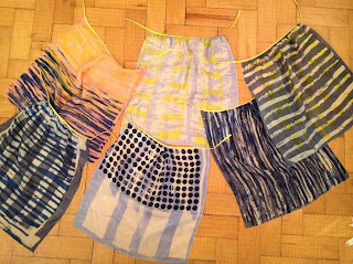
Me, Lillie, Emily and Olivia have joined forces within a group project to design and make 12 designs ready for selling at Indigo in 2015. We have all been engaged within our own projects focusing on individual elements; mine being composition, Lillie's being colour, Emily's being pattern and Olivia's being knit. To bring in all of our individual elements into one focused group we chose to look at mark-making within within patterns, textures and colours. In Grainne's first drawing workshop we explored this notion by exploring with drawing on paper. We looked at layering, bleaching, cutwork and opaque shapes.
We put all of our work together and selected the ideas we wanted to push and develop forward into print. Our drawings seem quite easy to translate into print:
1. dye the fabric
2. discharge into colour
3. layer up with colour
This will be the transition from paper to fabric for our working technique; as we now have established what our designs could look like we devised a timetable in order for us to be able to test out our ideas.
Monday 25th November: Identify S/S'15 trend and colour palette
Tuesday 26th November: Initial drawings, buy materials and bias binding
Wednesday 27th November: Dye fabrics and test colours and discharge
Thursday 28th November: Start discharge printing
Monday 2nd December: Finish all discharge printing
Tuesday 3rd December: Test out procion colour on top of backgrounds
Wednesday 4th December: Print over our backgrounds, steam, wash and apply to bias binding
Thursday 5th December: Presentation
In order for us to establish a colour palette we need to look at spring summer 2015 trend forecasts so that our designs are commercial for Indigo 2015.
We are going to use coral/peach, sky dusky blue and a navy colour with a yellow accent.
We chose between us to use a Navy, sky blue and a coral for backgrounds so that our designs have a form of unity between them. Here we are testing out the tones and shades with a discharge strip to see what colours, discharged the best and how we could incorporate these tones into our designs.
We used our drawings as a direct source for print inspiration when applying our discharge prints. These would form backgrounds that we would then work on top of afterwards. We then decided on which fabrics were working together as we had a mix of graphic and painterly designs; this was mainly due to our own individual styles coming through the designs.
Putting them into a collections of 2's unites the designs further and creates a striking contrast that flatters one another.
To develop our ideas further and to identify our foreground motifs we developed our drawings by combining these, making sure we have refined these to their maximum potential.
Photographing our work has been really helpful to make quick drawings and to keep a record of what is working well and what isn't.
It has also been an opportunity to refine our prints, and add our foreground patterns.
We have decided too take responsibility over a pair of prints each so that we could bring in elements from each one across to one another.
We have used acid dyes to bring the colours out and add a sense of vibrancy to each one. Once our prints have been steamed and washed we have attached bias binding in yellow and navy to compliment the colours in the print and to make the prints a collection.


No comments:
Post a Comment